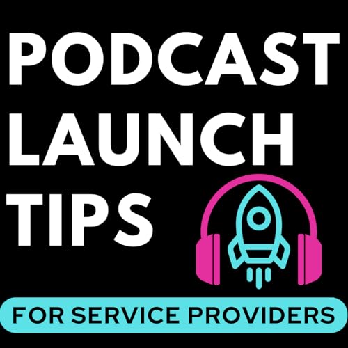
Is your podcast art costing you listeners? 🎨
In this eye-opening episode, I'm revealing my optimized podcast art protocol that could dramatically boost your show's visibility and attract your ideal audience!
Get ready to discover why your current artwork might be sabotaging your growth and how a few strategic tweaks could make all the difference. Trust me, this could be the game-changer your podcast needs!
Here's what we're unpacking: - The number one rule for creating attention-grabbing podcast art.
- Why your face might be hurting (not helping) your show's discoverability.
- The surprising power of background colors in attracting listeners.
- How to strategically use fonts and keywords to stand out in a crowded field.
But that's not all... - My personal font recommendation for maximum readability.
- The clever trick to highlighting your show's most important keyword.
- Why your podcast name and artwork are a two-part relay race (and how to win it).
- A real-life example of how optimized podcast art led to a $3,000 sale.
Attention service providers and entrepreneurs: If you're using your podcast to attract clients, these artwork insights are absolute must-knows!
Don't let another day go by with your amazing content hidden from potential listeners. Tune in to discover how to create podcast art that not only looks great but also drives real results.
Ready to give your podcast the visual boost it deserves? Let's create artwork that turns casual browsers into loyal listeners! 🚀🎧
🚨 Ready to get some help with optimizing your podcast launch? Check out our Podcast Launch Blueprint coaching program: https://www.podcastingbusiness.school/launch Apply to do a free 30 minute Podcast Launch Strategy session on the show: https://www.podcastingbusiness.school/apply


